

Substack In Primary Colors
When words went on a diet and logos learned geometry

Industrial age was all smoke and rivets.
Modernism was a hangover.
People looked at the mess, the clutter, the ornate nonsense glued to every surface and said the architectural equivalent of: ok, everyone shut up.
Form follows function.
Strip it. Simplify it. Clean lines or go home.
If Substack lived in that era, your newsletter would not be a parchment or a bronze plate. It would be a poster.
Flat cream background.
Three bars. One flag.
Primary colors. Sans serif.
Pinned to a smooth wall in a city that just discovered rectangles.
You would not fight for shelf space.
You would fight for alignment.
Communication got brutally tidy.
Decorative flourishes? Out.
Curly fonts? Out.
Sentences that wander? Get in the bin.
You can feel the design rules forming in real time:
No nonsense that does not carry meaning.
No ornament for ornament’s sake.
If a shape is there, it has a job.
Which sounds noble.
Until you realise emotion counts as ornament too in certain minds.
We still do this.
We call it “being concise” while trimming away every messy human edge that made the thing worth saying.
Three strange gifts from this era.
1. The grid quietly took power.
Posters, magazines, buildings, even city blocks started lining up around invisible scaffolds.
Columns. Margins. Ratios that felt “right.”
Your eye got trained like a dog. You see a neat grid and your brain sits. It assumes competence. Trust leaks in before any content arrives.
That is exactly what happens when you load a clean Substack page.
Logo at the top.
Title.
Body in a narrow column.
You feel calmer than on a chaotic site with flashing ads. Not because the words are wiser. Because the grid told your nervous system, “someone is in charge here.”
The medium whispers “order” before the message even speaks.
2. The logo learned to be a symbol, not a picture.
Old signs showed you a boot, a fish, a saint. Literal.
Modernist marks became shapes. Parallel lines. Circles. Angles.
They stopped trying to depict the thing and started representing the idea of the thing.
The Substack logo is a perfect modernist child.
Three lines. One triangle bite.
Suggests pages, stack, ribbon, book, signal.
No letters. Just form.
In the Bauhaus era, they would have adored it. Printed it at the top of a poster in flat orange, one simple word under it. Maybe not even the word. Maybe just the mark and a time and place.
Message: if you know, you know.
That is branding. That is also gatekeeping. Same tool, two moods.
3. Minimal text became an aesthetic flex.
Before, space was expensive so you crammed as much as possible into the sheet.
Now designers started saying the quiet rebellion: we will say less and let the white speak.
One word on a whole page.
One phrase.
One arrow.
And people actually stopped to look, because the emptiness felt intentional.
Compare that to your average timeline today, packed edge to edge. The posts that pop are the ones that dare to be simple.
One line.
One sentence.
No explanation, just a clean hit.
Modernism trained you to respect the quiet slide in a noisy deck.
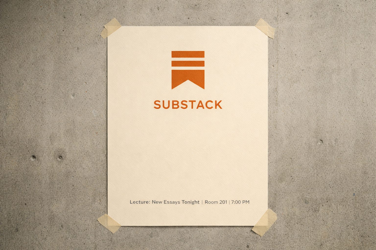
Picture the poster.
Horizontal frame. Concrete wall.
On it, a cream sheet taped dead straight.
Centered near the top, the Substack logo in solid black or muted orange, as clean as a geometry exercise. Under it, in tiny type, some functional copy. Meeting time. Lecture title. “New Essays Tonight.”
No swirls.
No extra icons.
No gradient pretending to be your personality.
Just the grid and the mark, humming with that smug, efficient calm.
People walk past. Half do not read it. They still register “this is part of the serious world.”
That is the superpower and the curse.
Good design can make emptiness feel important.
You and I have our own mini version of this.
We have frameworks, rules, tiny job cards that say “no fluff, concrete proof, one sharp turn.”
They save us from chaos.
They also tempt us to over-clean.
Because yes, a lean post looks sharp.
But shave too much and you end up with a perfectly aligned nothing.
So the question for this era is not “how do I make my writing cleaner.”
You already know how to do that.
The question is:
What mess am I secretly deleting in the name of elegance
that might be the only alive part of the message?